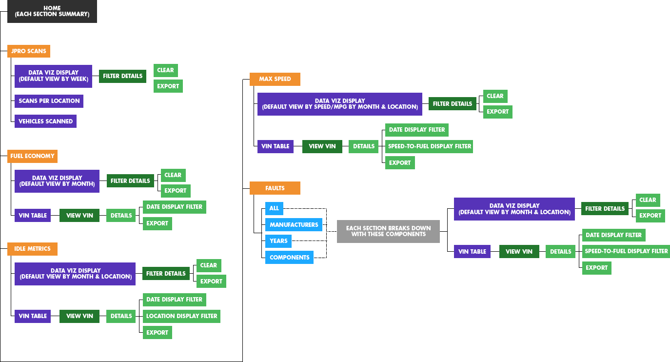
User Map
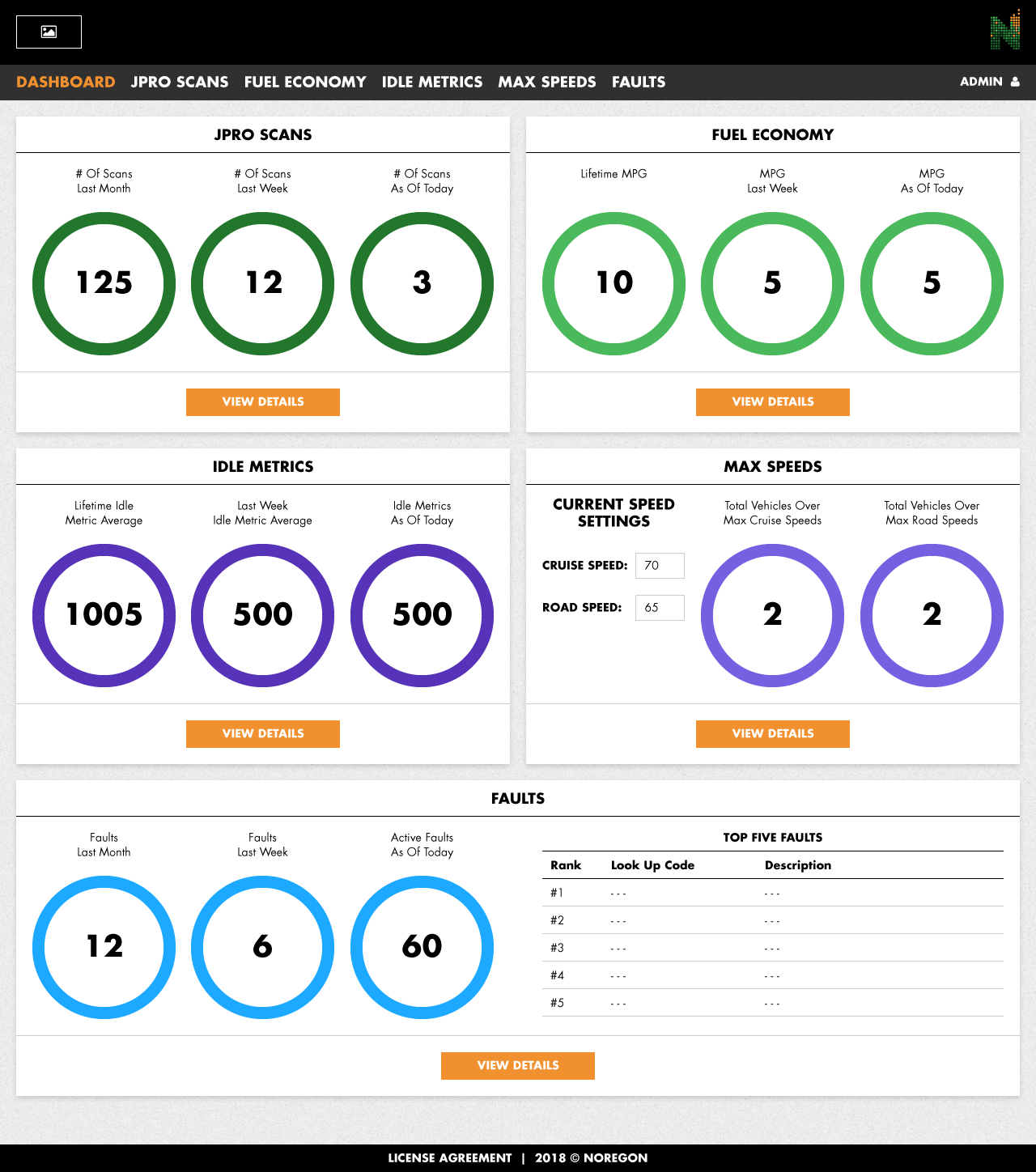
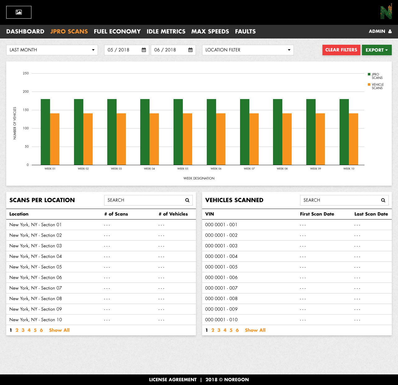
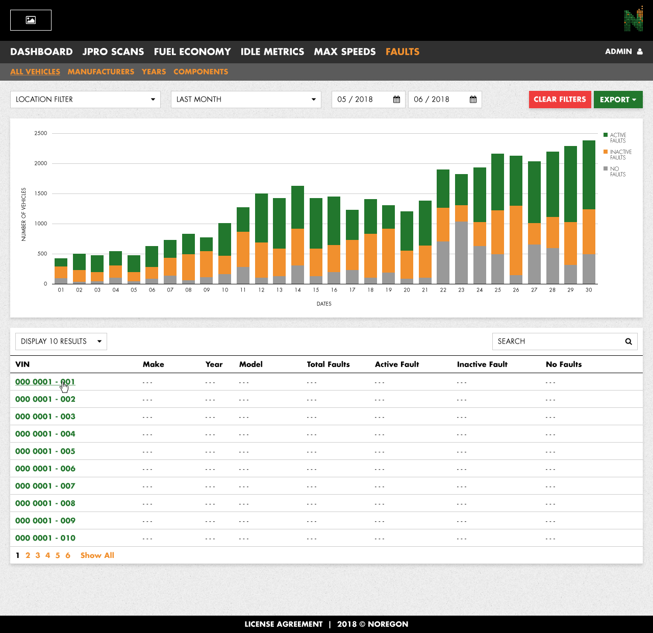
Research conducted on Noregon’s behalf went into what sections and features of the JPRO system would be expanded upon, cut down, or discarded altogether. Interactive charts, graphs, sortable tables, and several other components were included in the consideration as the user flow was refined over an iterative process.
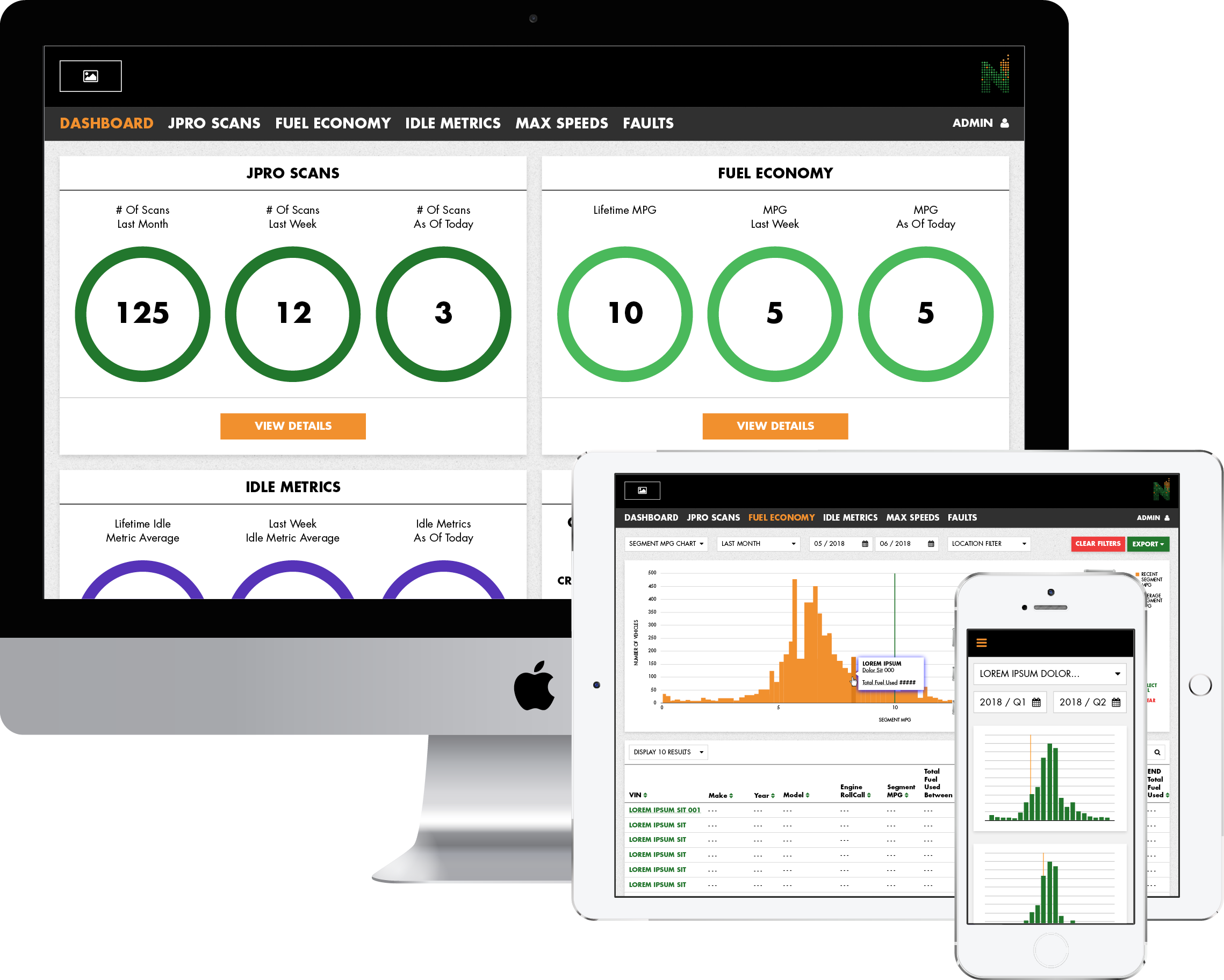
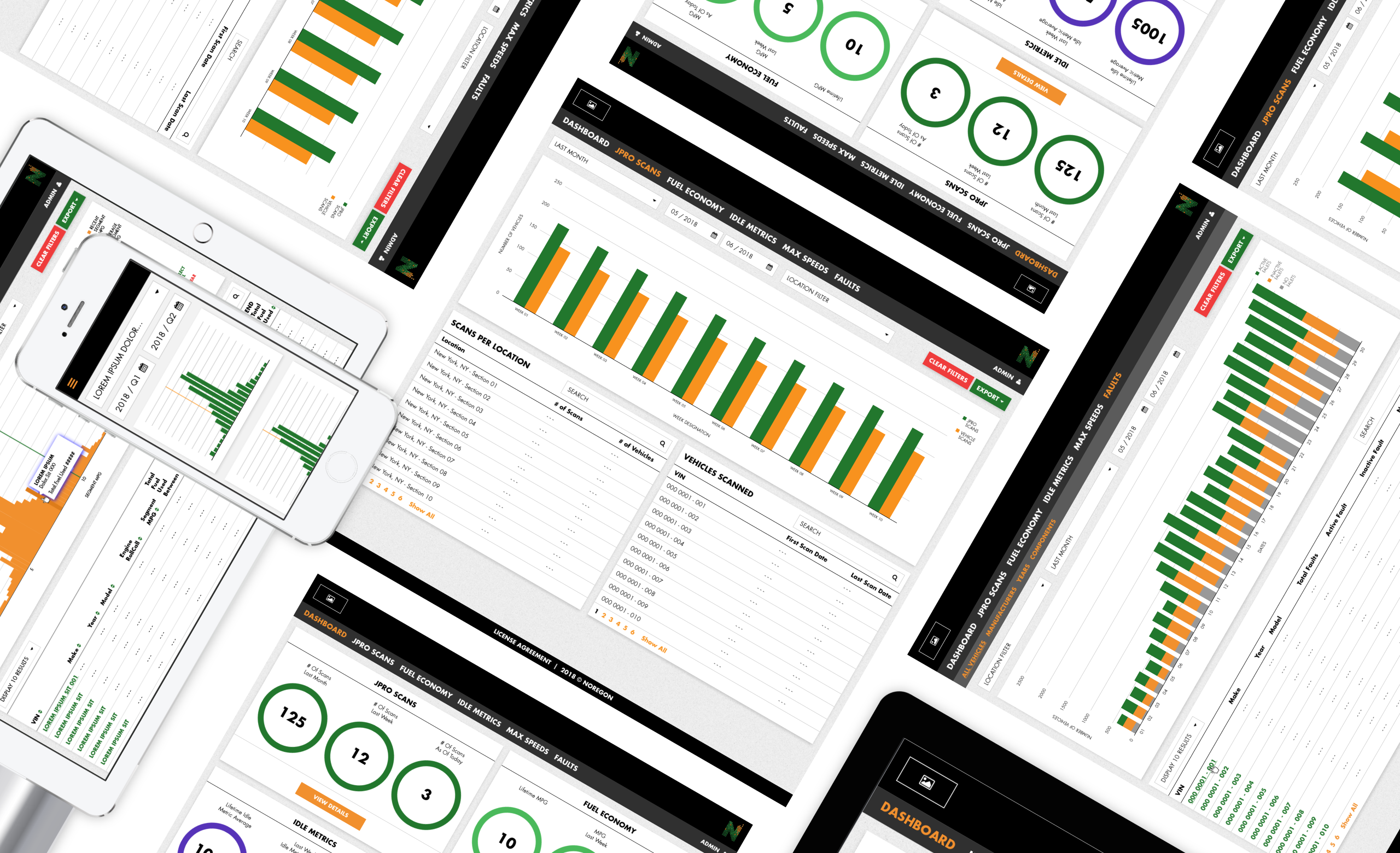
Layout Examples
With very little in the way of user research needing to be conducted, I took this opportunity to take the JPRO’s Android-adjacent look and make it brighter, more legibile, and simplified. In addition to the new design, building the new front-end required me to learn how to build the interactions of the data viz elements entirely in ShinyR to adapt elements carried over from the existing JPRO framework. Having never learned (or heard of) ShinyR before this project, this provided a unique challenge for me to keep expanding my front-end skillset and gave me a different approach to problem-solving I didn’t have before.