Project Goals & Considerations
The navigation of the consumer-side experience for the state’s signup website has not been updated since 2012. The proposed solution needed to focus on the following factors:
- Provide a CTA where the user can login to their account
- Reorganize existing navigation elements so they don’t interfere with an in-progress internal DOH project
- Continue to emphasize multiple language options
- Stay within current NYSOH/NYS branding
We also needed to account for additional limitations both from DOH and internally at GDIT before digging into the project’s designs:
- Design’s front-end must be built in the not-really-responsive JS/CSS NYSOH base made back in 2012
- Add an additional DOH-mandated list of links/navigation points
- Take DOH’s requested link list and give it a more clear hierarchy of information
- Find dead links in the live site and take them into account
Current Navigation Design

Current Navigation Design – Hover State

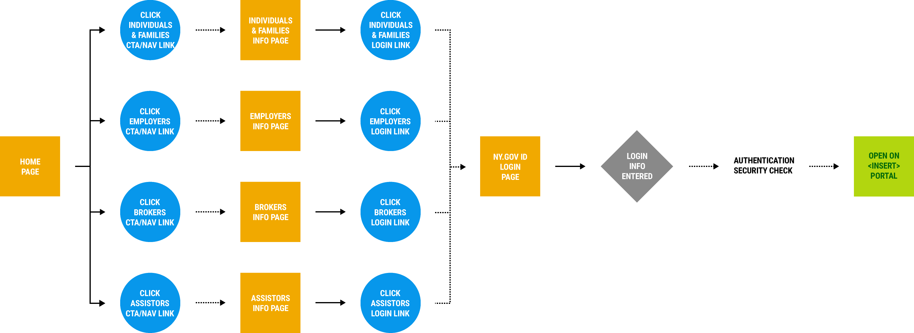
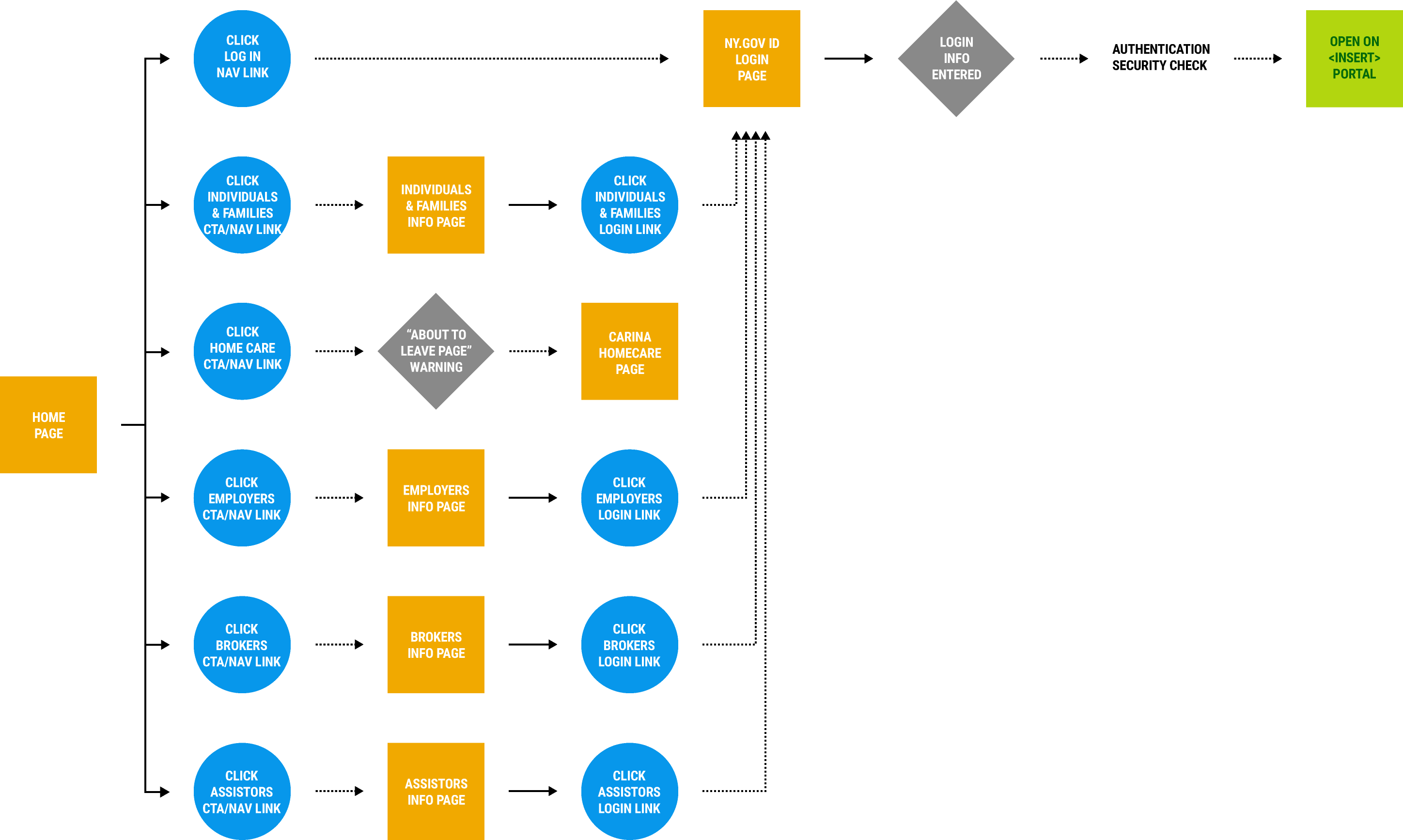
Current Login Flow
Proposed Redesign
Working in an iterative structure, myself and GDIT’s UI/UX lead went through only a handful of high fidelity revisions before we committed to our design decisions (thanks to our component libraries). In addition to addressing the project’s concerns, the aperture of our solution expanded to include:
- Removing outdated banners and contact data from the existing navigation
- Add a link/redirect for the upcoming Home Care program in the primary space of the navigation
- Reorder dropdown links in secondary dropdown menus according to internal information hierarchy as well as soliciting department feedback
- Ensure that the front-end solutions would be able to be adapted into a future mobile-optimization project (GDIT doesn’t have dedicated front-end devs, so this was all put on the design team by default)
Proposed Navigation Redesign

Proposed Navigation Redesign – Hover States


Proposed Login Redesign Flow
Conclusion
Ultimately, three things happened:
- Approval to have the Log In button act solely as a link to a dedicated NYSOH-branded login portal was shot down from DOH...
- ...and along with this decision, the Log In button was retrofitted into a dropdown with the dropdown links going to the respective info pages of the NYSOH program(s)
- GDIT’s existing tech deficit also ensured that the front-end JS/CSS base for our designs remain locked in perpetual Bootstrap amber
With all of the red tape considered (and decisions made out of our hands), I would say we accomplished as much as we could while continuing to force the modernization discussion internally at GDIT and with higher ups in the state government.