Brief
With the constant expansion of Dow’s digital projects and branding for new campaigns/partnerships, the creation of a design system was becoming increasingly necessary. What initially started as a UI component kit to work within Dow’s existing branding and dow.com components expanded significantly to become a larger, more futureproofed/scalable ecosystem called the Digital Customer Experience Design System.
Please note that this is a shortened, summarized version of this project’s study. If you would like a more in-depth walkthrough, please contact me.
Personnel
UI/UX
Brandwidth
2022 - 2024
2 Design Directors
2 Lead Designers
2 Senior Designers (inc. me)
1 Junior Designer
1 User Researcher/Strategist
1-2 Project Managers
10+ Developers
Previous UI kit example before consolidation efforts
My Tasks and Responsibilities
As one of Brandwidth’s senior designers (and the designer that championed the need for this project), my tasks were:
- Test existing and future components against usability and WCAG standards
- Assess and assimilate/eliminate redundant components and UI elements
- Write/revise rule proposals for components and design standards
- Update/maintain a Figma variable library that conformed to the new colors, spacing, fonts, etc rules that we were beginning to establish for the design system
- Liase throughout iteration and refining processes with our lead designers to ensure consistency, doublecheck ideas and in-progress projects to ensure no overlap
- Lead walkthroughs with Brandwidth’s developers (sometimes on my own, sometimes with another designer or PM) to make sure that new components and rules would be feasible within the frameworks of current projects
- Sit in on multiple check-ins each week with project managers from Brandwidth and Dow to address deadlines or issues that may have risen
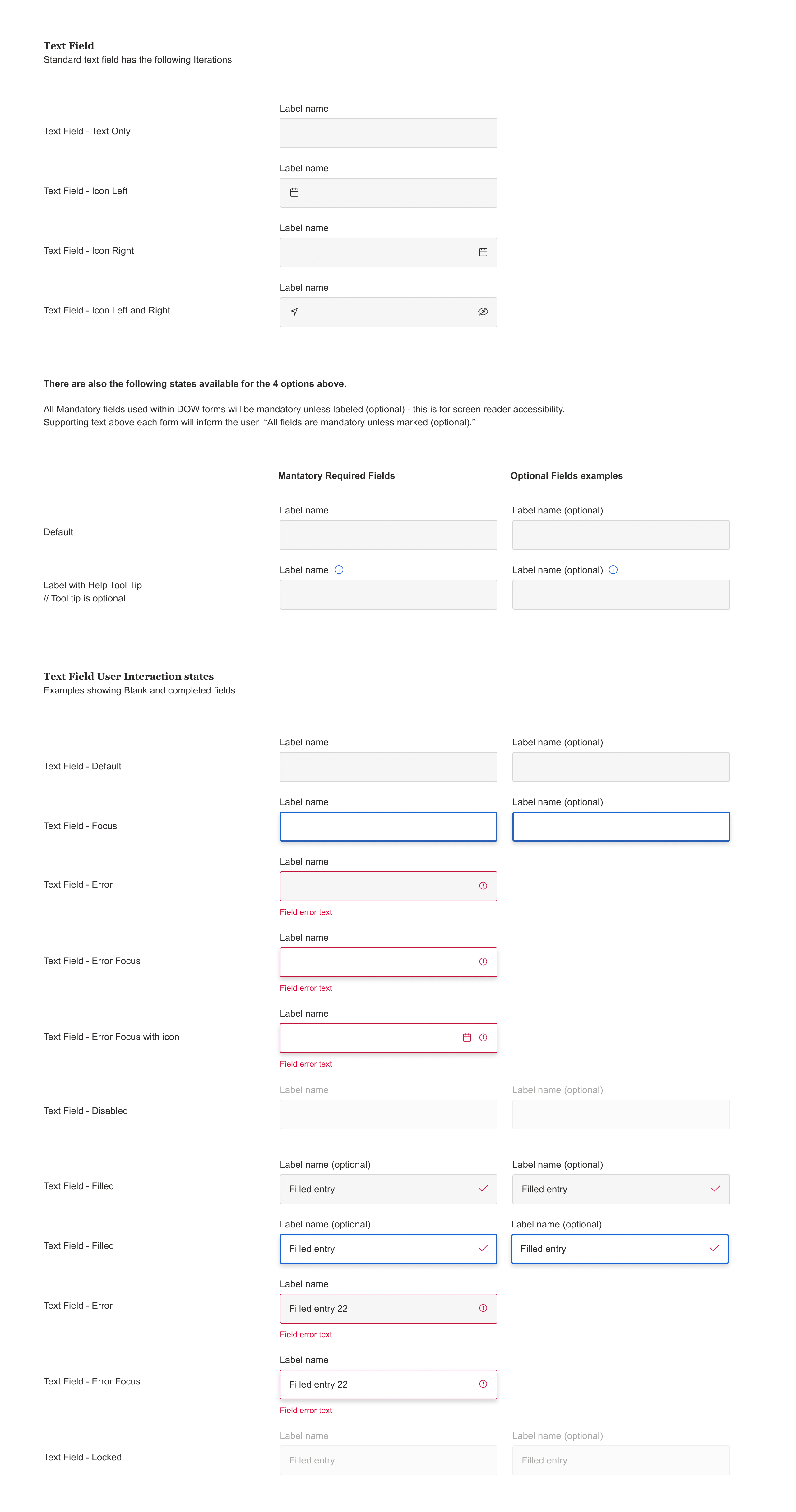
Primary component breakdown example (Forms and Inputs)
Outcome
The deployment of these new components and design updates are projected to cut development time for new sites and features by upwards of 40% in 2025 and beyond. You can see the rollout of these components and new design standards across every avenue of dow.com, its customer journeys, subsequent branding updates, social media content, and other interactive web projects I did for Dow when I was at Brandwidth.
I need to give specific shoutouts to Pete Brown and Paul Tumber, Brandwidth’s design leads, for pushing me on this project in some specific avenues:
- The creation/cultivation of a variable database in Figma. This tool got introduced to Figma during the course of this project, and Pete dove in headfirst figuring out how to make it work for us. It was incredibly useful for updating large portions of the design system more easily, while adhering to the spacing and layout rules we were refining. All the work I did within these particular nuts and bolts is based on Pete’s pioneering.
- Integrate more microinteractions into the components. Before Paul’s input, hover and transition states in the majority of the components were either too blunt or too sluggish. Components now adhere to a snappier animation style, fitting with some of Dow’s more traditional brand elements. This was a simple adjustment Paul pushed that garnered tons of positive feedback.
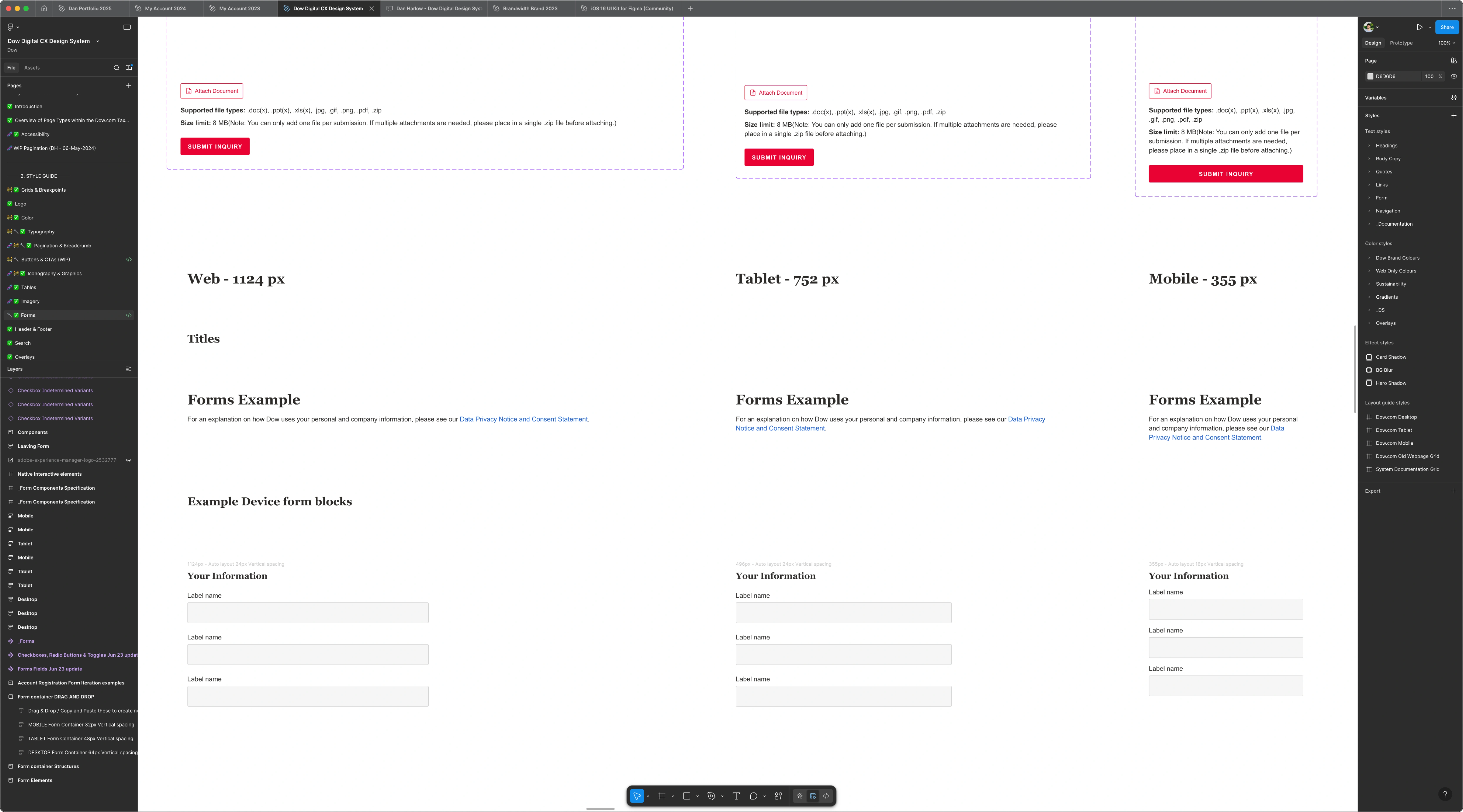
Figma WIP
Research and Development
Brandwidth’s initial goals when the scope was still treating this like a UI kit more than a design system were as follows:
- Make existing components in all dow.com avenues more mobile-friendly
- Identify typographic inconsistencies in existing components and update them with a uniform set of sizes, styles, and spacing that meet WCAG legibility requirements
- Make adjustments in order to comply with W3C accessibility standards, when applicable
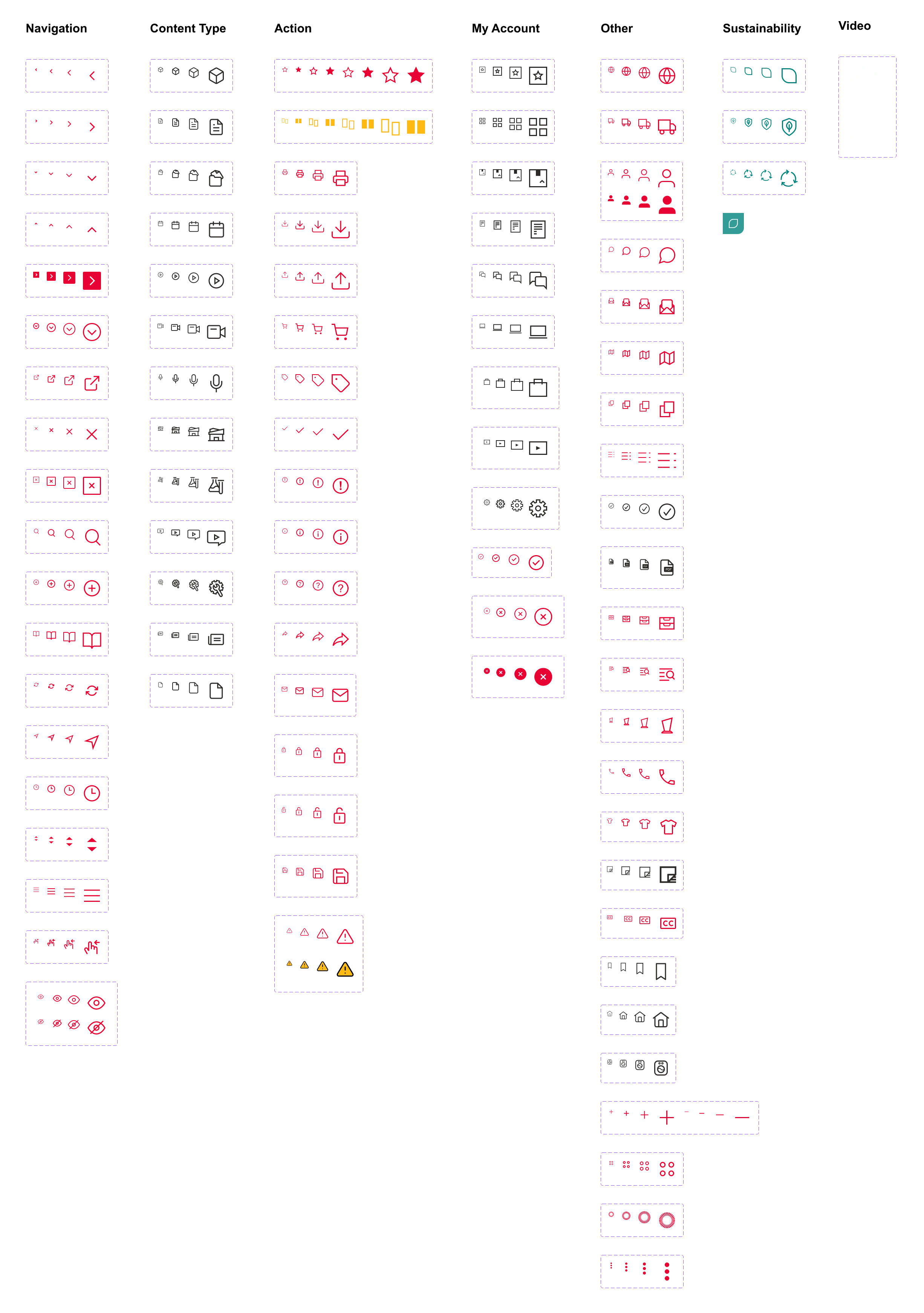
- Create and maintain an icon library
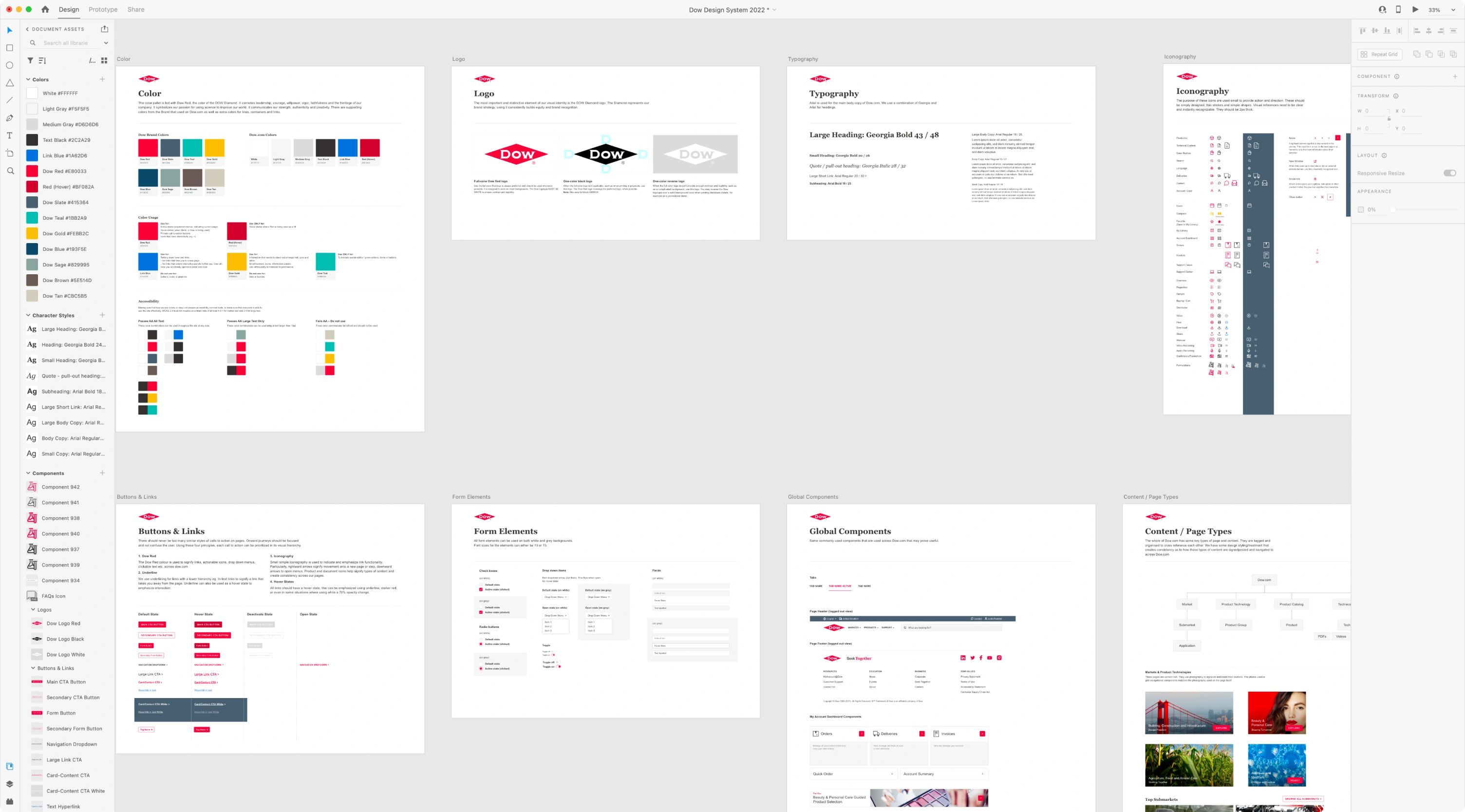
- Collect, categorize, and organize all existing components across Adobe XD, Sketch, and Figma files into one Figma file in order to assess redundancies and start implementing the above standardizations
This was the first design system that anyone on the design team at Brandwidth had created. Since we realized that there was going to be a learning curve across the team, our user researcher Millie Spalding laid out an effective plan of attack for us to start addressing pain points while we were still gathering/assessing the existing components. She found the scale practices of other company’s design systems like Google’s Material, Pinterest’s Gestalt, and IBM’s Carbon which provided the approach we’d use for consolidating older/outdated components into newer ones. The documentation from Gestalt (and Millie pointing me to Cintia Romero’s Axecon talk on accessible design systems) helped considerably.
The goals and research at the earliest stages of the project were overseen by Brandwidth’s design director at the time, Rich Cousins. Prior to his departure, we concluded from our research and iterations that we needed to expand the scope from a simple, small-scale UI kit to a larger scalable design system.
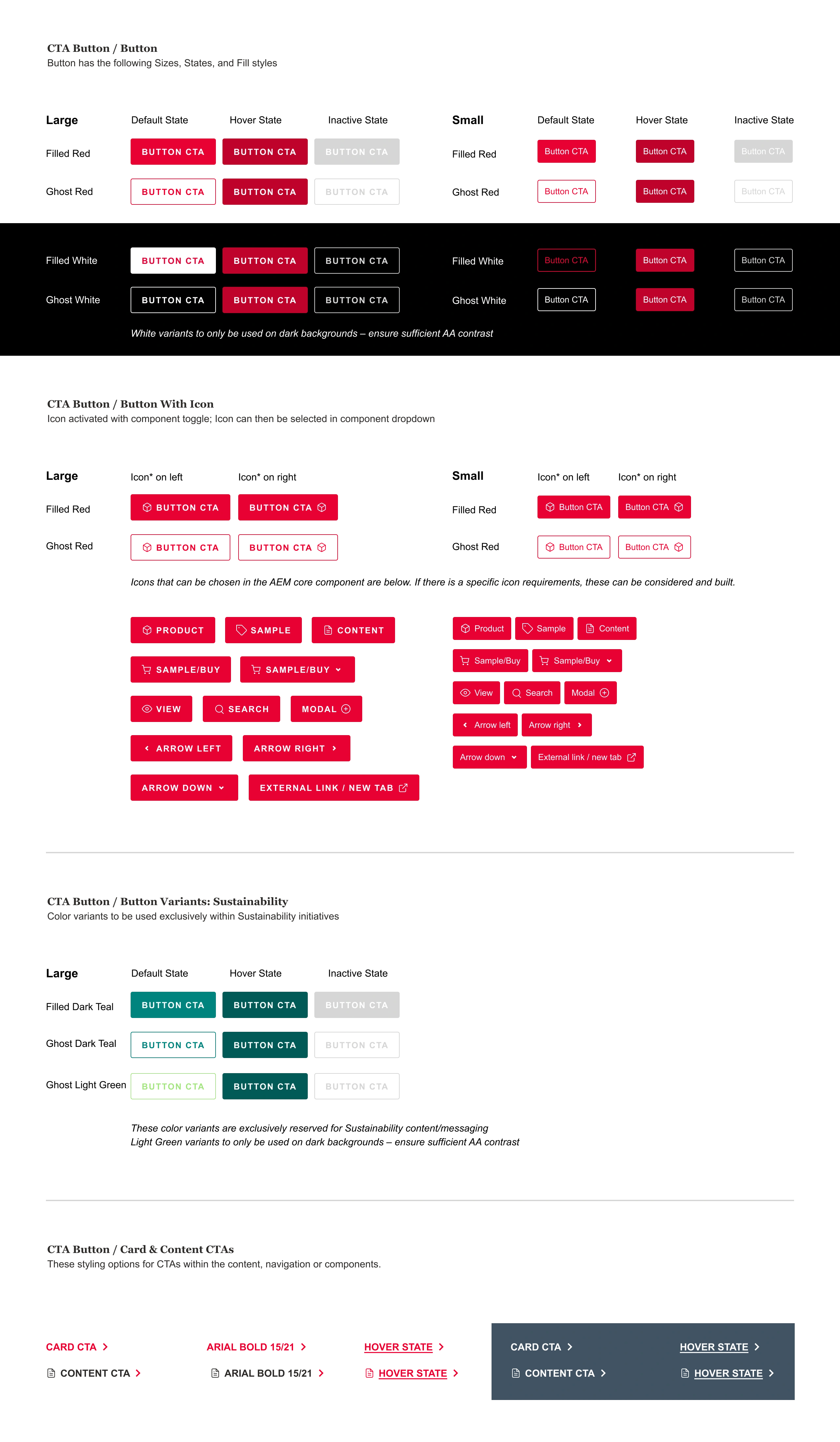
Buttons and CTAs
Icon Library
Additional Challenges
Once it became clear we needed to expand the system's scope, this meant a few things:
- Be able to do more efficient version control on individual components and page updates
- Rearrange layout structure to accommodate drastic content updates for larger sections that needed more detailed writing on subjects like accessibility, user personas, and sustainability branding
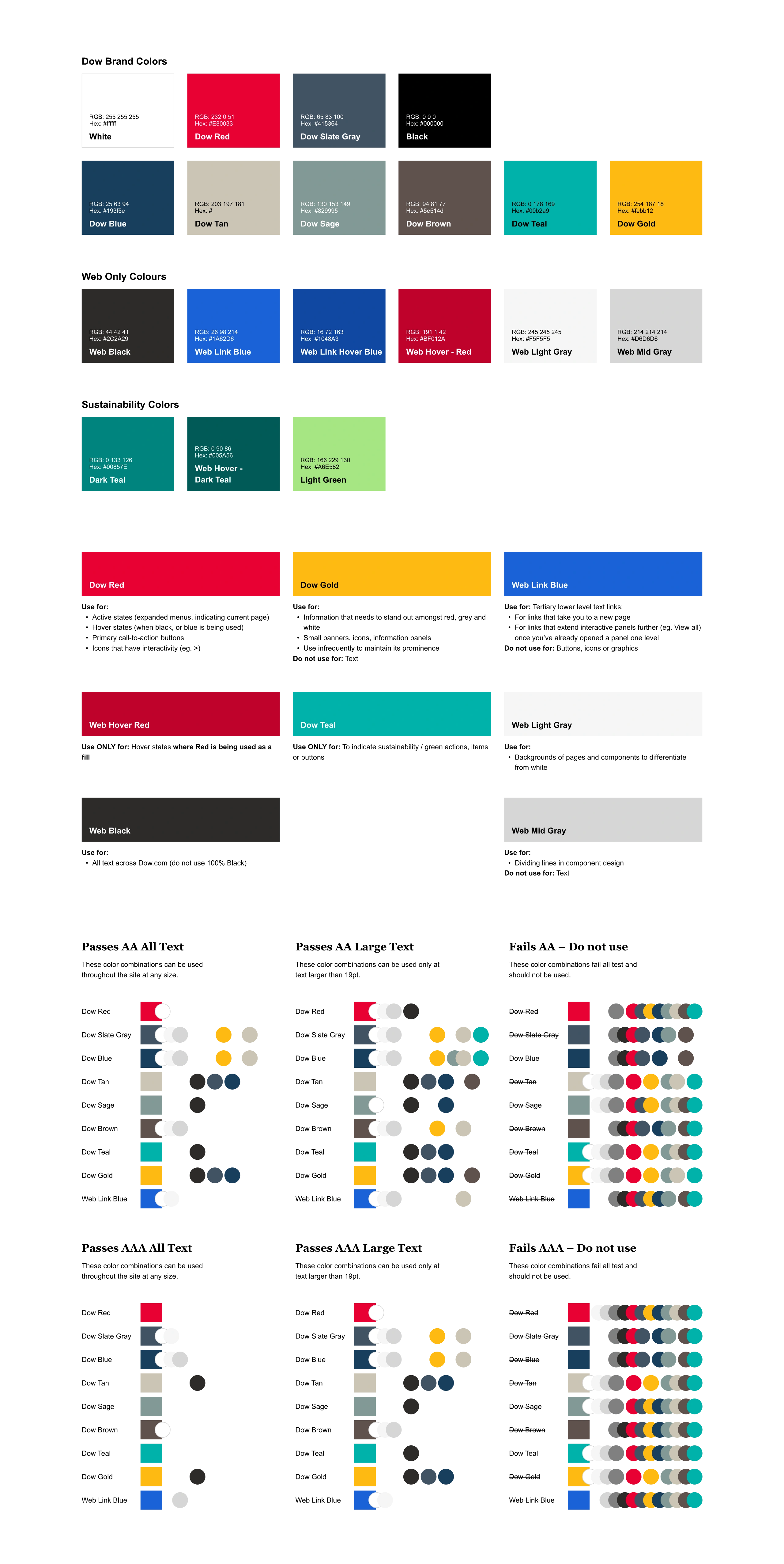
At this point, one of the largest visual challenges I knew we needed to conquer was working with that violent shade of red central to Dow’s branding. Dow understandably did not want this diminished, so the expansion and introduction of new colors and color rules went through numerous iterations and tests to meet accessibility concerns. These decisions reverberated throughout the system, improving accessibility and legibility within nearly every component possible.
Progress continued under Alex Carvalho, who served as Brandwidth’s design director for a brief part of 2023. His insights into this project’s expansion stage were very valuable, due to his greater design system experience. Without his knowledge and supervision, we would not have been able to:
- Make a system like supernova.io easy for us to present the system for stakeholders and the public
- Create a more digestible information hierarchy for rules and components
- Leave enough breathing room within this new hierarchy to allow for expansion and additions
- Force the client to make decisions about the validity of older components (thus archiving them and cleaning up the system further)
Color Useage and Contrast/Legibility Check Exploration