Brief
My Account is the ordering system used throughout Dow to purchase materials, track orders, and organize product and customer lists. Its utilities includes catalogs for products and brand families, invoicing and returns, customer and contract management, as well as an admin backend.
Brandwidth was tasked with giving the entire enterprise a facelift, removing redundancies, and streamlining the customer’s ordering experience. These goals would also allow us to begin integrating components and rules of the Dow Design System (you can read more about that here).
Please note that this is a shortened, summarized version of this project’s study. If you would like a more in-depth walkthrough, please contact me.
Personnel
UI/UX
Brandwidth
2022 - 2024
1 Lead Designer
2 Senior Designers (inc. me)
1 Junior Designer
3-4 Project Managers
10+ Developers
My Tasks and Responsibilities
As the senior designer, the majority of my tasks across the My Account system were:
- Create quick proof-of-concept wireframes
- Create production-ready designs based on wires and component library
- Liaise throughout iteration processes with lead designer to ensure consistency, doublecheck ideas and actionable items
- Ensure no overlap with other in-progress/parallel My Account assignments (since multiple designers often worked in the same files at once)
- Maintain updates to My Account components and layouts as the Dow Design System was also being built
- Reorganize and redesign existing navigation to be scalable and have room for the inclusion of new CTAs and sub-navigation
- Retroactively update older layouts to meet Dow’s newer branding and design standards
- Take multiple cart systems throughout Dow and consolidate them to a single consistent flow
- Test future and in-progress designs against usability and WCAG standards
- Conduct walkthroughs with Brandwidth’s and Dow’s developers
- Provide multiple daily check-ins with Brandwidth’s project managers that were in charge of particular items
- Occasionally lead client-facing presentations and reviews
UX initial action/result assessment example
Individual component assessment/adjustment example
Outcome
The introduction of the Dow Design System standards and components in the rolled out phases caused support ticket filings to drop by about 30% overall. Additionally, tickets around navigation (i.e. “where is X” or “how to get to X”) dropped by over 50% after the navigation redesigns were put in.
The more streamlined, unified checkout process led to reduced cart abandonment and support ticket filings around this issue. This has lead to improved, faster ordering (an initial uptick of 15%) based around more familiar e-commerce steps and checks. Internal heat maps showed that users would also often explore these newer product spotlights more, even if they didn’t ultimately purchase them. Comments around the addition of the dashboard made users feel like their account was more personalized, ultimately using the dashboard CTAs as much as the main navigation for starting their journey. The introduction of the new Dow Design System standardizations in the rolled out sections inspired a lot of comments like “this just *feels* so much nicer” and “I love that this will actually work on my phone now.”
Before the redesigns, the entire My Account system was cluttered and outdated, lacking the polish and ease-of-use that the public-facing dow.com experience has. Now, people purchasing products through Dow finally have a modern-feeling interface and a smoother experience.
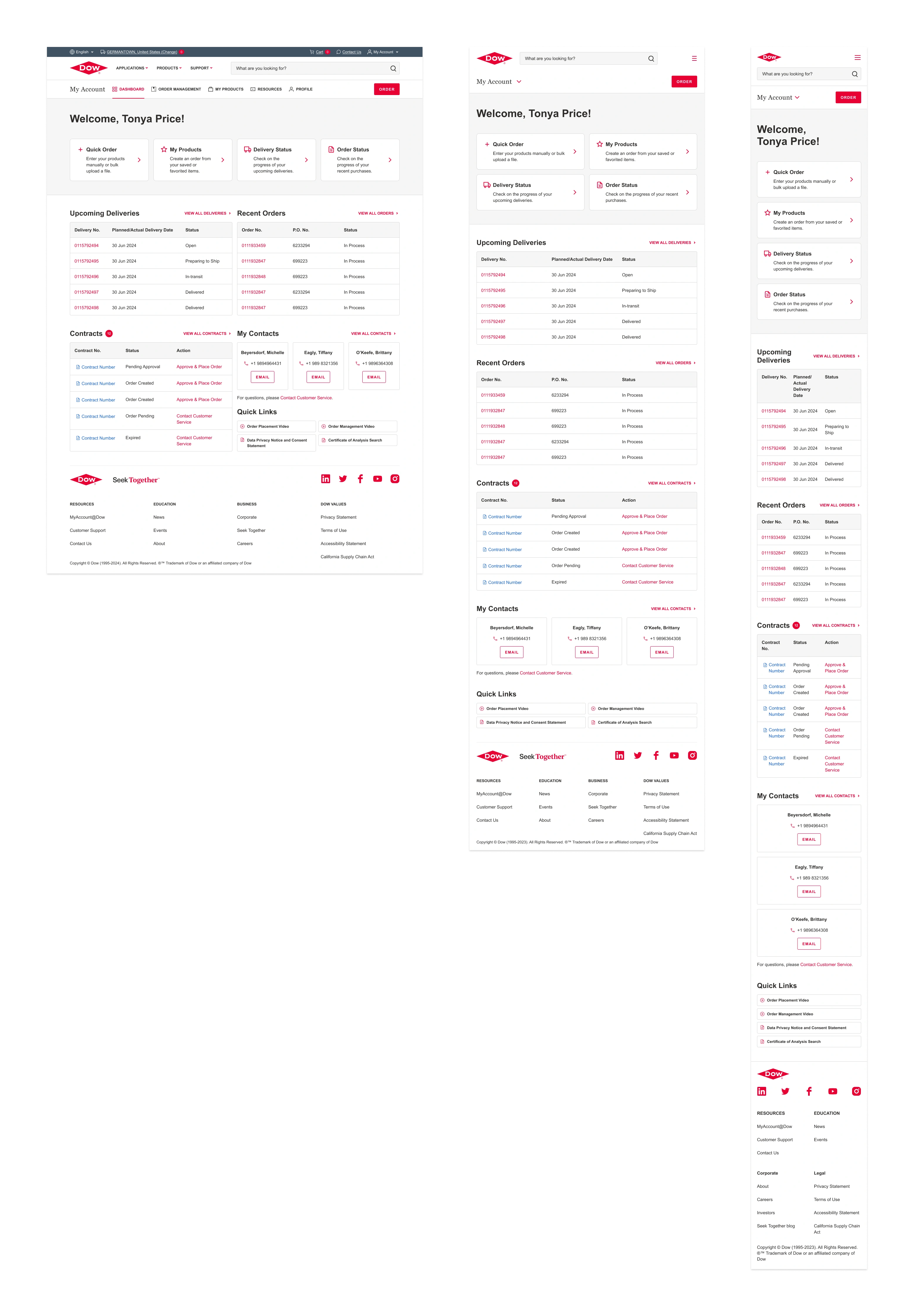
Dashboard example
Research and Development
Even though Brandwidth had a dedicated user researcher as part of our design team, we were allowed very little input or control on Dow’s part to organize groups of My Account users (general buyers, distributors, chemists, etc) for any questionnaires or testing. Relying entirely on feedback supplied to us by Dow meant that, more often than not, we were forced to base design decisions around A) looking at other large scale UI/UX systems similar to Dow’s competitors (and e-commerce best practices) and B) limitations around the in-development Dow Design System component updates.
For cost cutting measures, Brandwidth’s developers and programmers were put in backup roles on this project in favor of Dow’s outsourced development team in China. The handful of conversations with this outside team were not productive since they boxed themselves years ago into using Wordpress templates and Bootstrap parameters. Despite the insistence and demonstrations by BW’s developers that the back end and front end needed updating (and that this was the perfect avenue with which to introduce these updates), the Dow team stated this was the only way to build our proposed updates with the budgets/timeframes allowed.
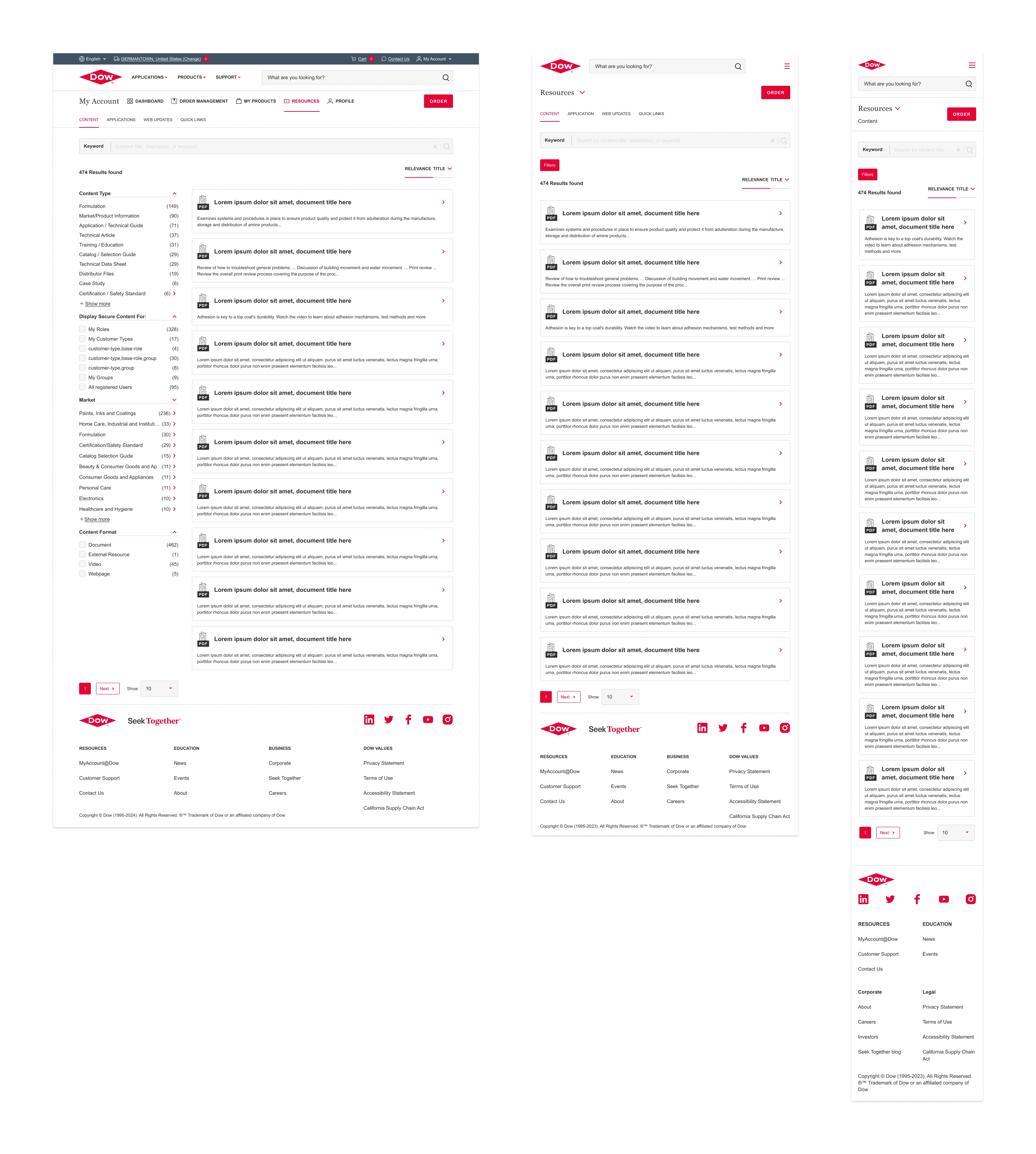
Page example (Resources → Content)
Additional Challenges
Instead of building out the Dow Design System first and then beginning redesigns in My Account with those new updates, we were forced to balance them parallel to each other which affected the crunch of both projects. Benchmarks for My Account accomplishments were often made from outside of the design team’s purview without our input. Brandwidth was also operating without someone consistently filling the design director role for most of 2023 and all of 2024, leaving all of us to double down on our own about project management.
With both My Account and Dow Design System forced to run hand in hand, we would timeline as far ahead as we could to see where the gaps and intersections would be between them. This allowed us to plan/refine parts of the system ahead of time and make the updates to My Account with the new components/rules not as costly in time/effort on both the design and development sides.
Accessibility assessment example